Matplotlib
Data visualization is a key skill for aspiring data scientists. Matplotlib makes it easy to create meaningful and insightful plots. In this chapter, you’ll learn how to build various types of plots, and customize them to be more visually appealing and interpretable
Line plot (1)
With matplotlib, you can create a bunch of different plots in Python. The most basic plot is the line plot. A general recipe is given here.
import matplotlib.pyplot as plt
plt.plot(x,y)
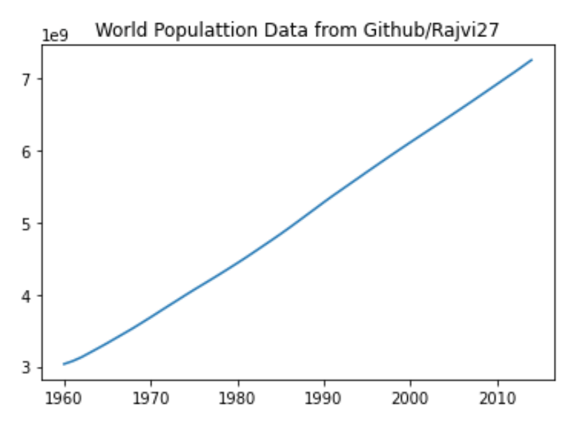
plt.show()In the video, you already saw how much the world population has grown over the past years. Will it continue to do so? The world bank has estimates of the world population for the years 1950 up to 2100. The years are loaded in your workspace as a list called year, and the corresponding populations as a list called pop.
This course touches on a lot of concepts you may have forgotten, so if you ever need a quick refresher, download the Python for data science Cheat Sheet and keep it handy!
import pandas as pd
import matplotlib.pyplot as plt
import numpy as np

filename = 'world_ind_pop_data.csv'
world_ind_pop = pd.read_csv(filename)
print(world_ind_pop.columns)

# Data Sourced From https://github.com/Rajvi27/Assignment__3
Index(['CountryName', 'CountryCode', 'Year', 'Total Population',
       'Urban population (% of total)'],
      dtype='object')
filtered_world_ind_pop = world_ind_pop[world_ind_pop['CountryCode'] == 'WLD']

year = filtered_world_ind_pop['Year'].to_list()
pop = filtered_world_ind_pop['Total Population'].to_list()


# Print the last item from year and pop
print(year[-1])
print(pop[-1])

# Determine size of plot in jupyter
plt.rcParams["figure.figsize"] = (6,4)

# Make a line plot: year on the x-axis, pop on the y-axis
plt.plot(year,pop)
plt.title('World Populattion Data from Github/Rajvi27')
plt.show()
2014
7260710677.0
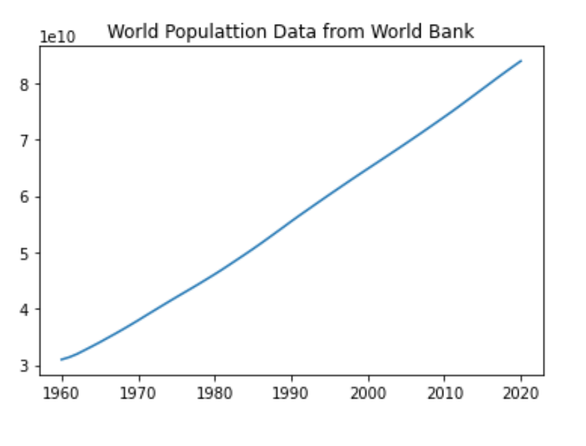
# Data sourced from https://data.worldbank.org/indicator/SP.POP.TOTL
filename = 'API_SP.POP.TOTL_DS2_en_csv_v2_4019998.csv'
world_bank = pd.read_csv(filename, header = 2)
# print(world_bank.head(1))

# filter columns needed
world_bank_filter = world_bank.iloc[:,4:65]
# print(world_bank_filter.head(1))

WB_Filt_Sum = world_bank_filter.sum()
pop = WB_Filt_Sum.to_list()
# print(pop)

year = world_bank_filter.columns.to_list()
# print(year)

# Print the last item from year and pop
print(year[-1])
print(pop[-1])

# Determine size of plot in jupyter
plt.rcParams["figure.figsize"] = (6,4)

# Make a line plot: year on the x-axis, pop on the y-axis
plt.plot(year,pop)
plt.title('World Populattion Data from World Bank')
plt.xticks(['1960','1970','1980','1990','2000','2010','2020'], ['1960','1970','1980','1990','2000','2010','2020'])
plt.show()
2020
83920568496.0
Line plot (3)
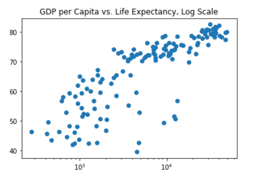
Now that you’ve built your first line plot, let’s start working on the data that professor Hans Rosling used to build his beautiful bubble chart. It was collected in 2007. Two lists are available for you:
life_exp which contains the life expectancy for each country and
gdp_cap, which contains the GDP per capita (i.e. per person) for each country expressed in US Dollars.
GDP stands for Gross Domestic Product. It basically represents the size of the economy of a country. Divide this by the population and you get the GDP per capita.
filename = 'gapminder.csv'
gapminder_2007 = pd.read_csv(filename, index_col=0)
print(gapminder_2007.columns)

gdp_cap = gapminder_2007['gdp_cap'].to_list()
life_exp = gapminder_2007['life_exp'].to_list()
Index(['country', 'year', 'population', 'cont', 'life_exp', 'gdp_cap'], dtype='object')
# Print the last item of gdp_cap and life_exp
print(gdp_cap[-1])
print(life_exp[-1])
469.7092981
43.487
Scatter Plot (1)
When you have a time scale along the horizontal axis, the line plot is your friend. But in many other cases, when you’re trying to assess if there’s a correlation between two variables, for example, the scatter plot is the better choice. Below is an example of how to build a scatter plot.
import matplotlib.pyplot as plt
plt.scatter(x,y)
plt.show()
Let’s continue with the gdp_cap versus life_exp plot, the GDP and life expectancy data for different countries in 2007. Maybe a scatter plot will be a better alternative?
# Change the line plot below to a scatter plot
plt.scatter(gdp_cap, life_exp)

# Show plot
plt.rcParams["figure.figsize"] = (6,4)
plt.show()

# Put the x-axis on a logarithmic scale
plt.scatter(gdp_cap, life_exp)
plt.xscale('log')

# Show plot
plt.rcParams["figure.figsize"] = (6,4)
plt.show()

Scatter plot (2)
In the previous exercise, you saw that the higher GDP usually corresponds to a higher life expectancy. In other words, there is a positive correlation.
Do you think there’s a relationship between population and life expectancy of a country? The list life_exp from the previous exercise is already available. In addition, now also pop is available, listing the corresponding populations for the countries in 2007. The populations are in millions of people.
pop = gapminder_2007['population'].to_list()

# Build Scatter plot
plt.scatter(pop,life_exp)

# Show plot
plt.rcParams["figure.figsize"] = (6,4)
plt.show()
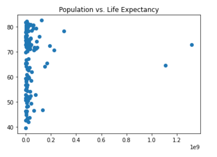
There’s no clear relationship between population and life expectancy, which makes perfect sense.
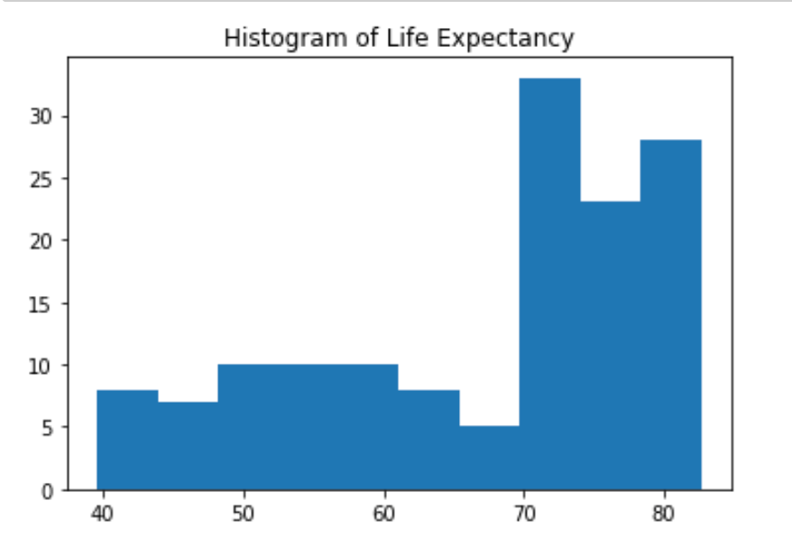
Build a histogram (1)
life_exp, the list containing data on the life expectancy for different countries in 2007, is available in your Python shell.
To see how life expectancy in different countries is distributed, let’s create a histogram of life_exp.
# Create histogram of life_exp data
plt.hist(life_exp)

# Display histogram
plt.rcParams["figure.figsize"] = (6,4)
plt.show()
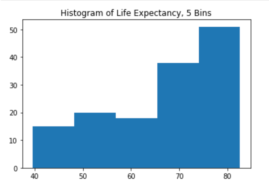
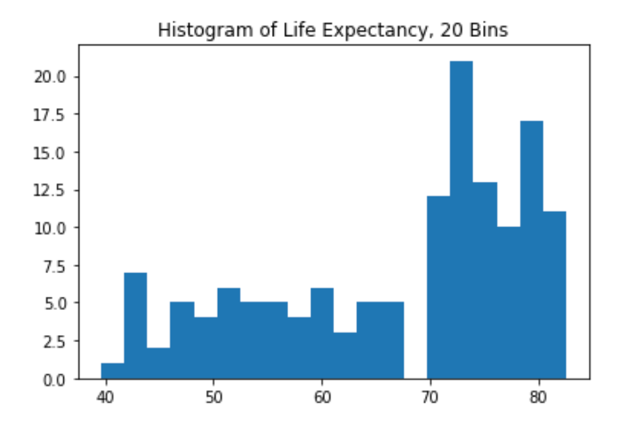
Build a histogram (2): bins
In the previous exercise, you didn’t specify the number of bins. By default, Python sets the number of bins to 10 in that case. The number of bins is pretty important. Too few bins will oversimplify reality and won’t show you the details. Too many bins will overcomplicate reality and won’t show the bigger picture.
To control the number of bins to divide your data in, you can set the bins argument.
That’s exactly what you’ll do in this exercise. You’ll be making two plots here. The code in the script already includes plt.show() and plt.clf() calls; plt.show() displays a plot; plt.clf() cleans it up again so you can start afresh.
# Build histogram with 5 bins
plt.hist(life_exp,bins=5)

# Show and clean up plot
plt.rcParams["figure.figsize"] = (6,4)
plt.show()
plt.clf()

# Build histogram with 20 bins
plt.hist(life_exp,bins=20)

# Show and clean up again
plt.rcParams["figure.figsize"] = (6,4)
plt.show()
plt.clf()
<Figure size 432x288 with 0 Axes>
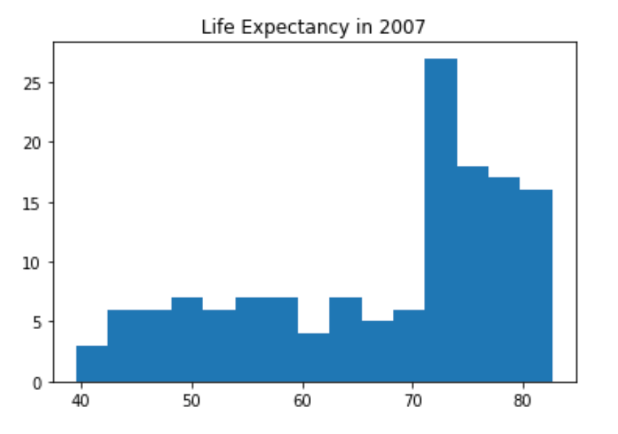
Build a histogram (3): compare
In the video, you saw population pyramids for the present day and for the future. Because we were using a histogram, it was very easy to make a comparison.
Let’s do a similar comparison. life_exp contains life expectancy data for different countries in 2007. You also have access to a second list now, life_exp1950, containing similar data for 1950. Can you make a histogram for both datasets?
# Data pulled from https://www.gapminder.org/data/
filename = 'life_expectancy_years.csv'
df = pd.read_csv(filename)
life_exp1950 = df['1950'].to_list()

# Histogram of life_exp, 15 bins
plt.hist(life_exp,bins=15)

# Show and clear plot
plt.title('Life Expectancy in 2007')
plt.rcParams["figure.figsize"] = (6,4)
plt.show()
plt.clf()

# Histogram of life_exp1950, 15 bins
plt.hist(life_exp1950,bins=15)

# Show and clear plot again
plt.title('Life Expectancy in 1950')
plt.rcParams["figure.figsize"] = (6,4)
plt.show()
plt.clf()

<Figure size 432x288 with 0 Axes>
Labels
It’s time to customize your own plot. This is the fun part, you will see your plot come to life!
You’re going to work on the scatter plot with world development data: GDP per capita on the x-axis (logarithmic scale), life expectancy on the y-axis. The code for this plot is available in the script.
As a first step, let’s add axis labels and a title to the plot. You can do this with the xlabel(), ylabel() and title() functions, available in matplotlib.pyplot.
# Basic scatter plot, log scale
plt.scatter(gdp_cap, life_exp)
plt.xscale('log')

# Strings
xlab = 'GDP per Capita [in USD]'
ylab = 'Life Expectancy [in years]'
title = 'World Development in 2007'

# Add axis labels
plt.xlabel(xlab)
plt.ylabel(ylab)

# Add title
plt.title(title)

# Determine size of plot in jupyter
plt.rcParams["figure.figsize"] = (6,4)

# After customizing, display the plot
plt.show()
plt.clf()
<Figure size 432x288 with 0 Axes>
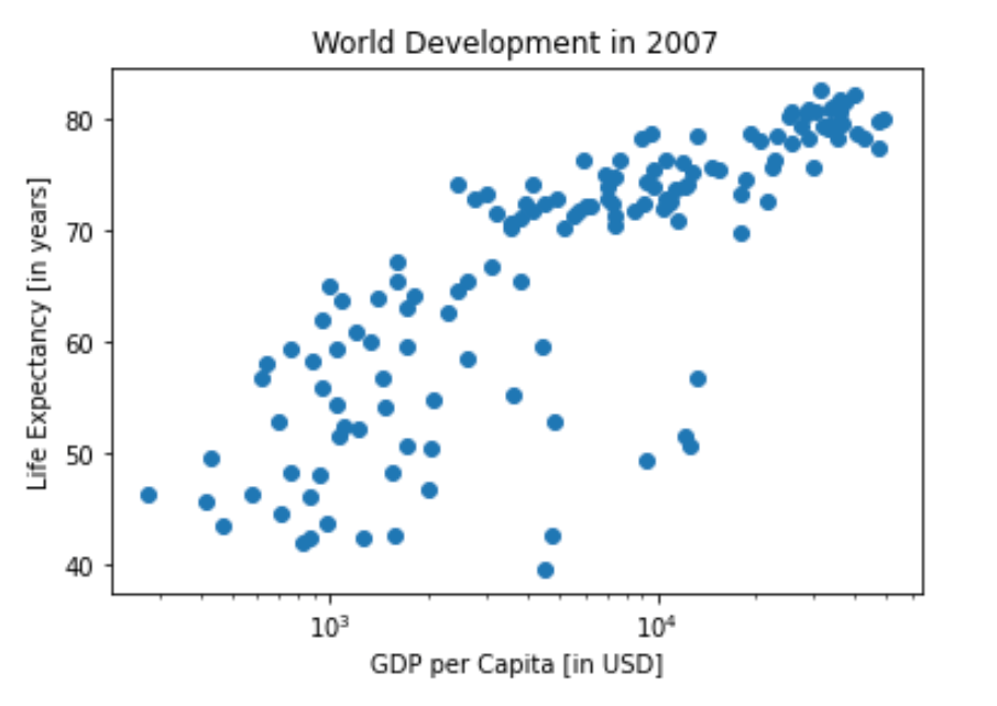
Ticks
The customizations you’ve coded up to now are available in the script, in a more concise form.
In the video, Hugo has demonstrated how you could control the y-ticks by specifying two arguments:
plt.yticks([0,1,2], ["one","two","three"])In this example, the ticks corresponding to the numbers 0, 1 and 2 will be replaced by one, two and three, respectively.
Let’s do a similar thing for the x-axis of your world development chart, with the xticks() function. The tick values 1000, 10000 and 100000 should be replaced by 1k, 10k and 100k. To this end, two lists have already been created for you: tick_val and tick_lab.
# Scatter plot
plt.scatter(gdp_cap, life_exp)

# Previous customizations
plt.xscale('log')
plt.xlabel(xlab)
plt.ylabel(ylab)
plt.title(title)
plt.rcParams["figure.figsize"] = (6,4)

# Definition of tick_val and tick_lab
tick_val = [1000, 10000, 100000]
tick_lab = ['1k', '10k', '100k']

# Adapt the ticks on the x-axis
plt.xticks(tick_val,tick_lab)

# After customizing, display the plot
plt.show()

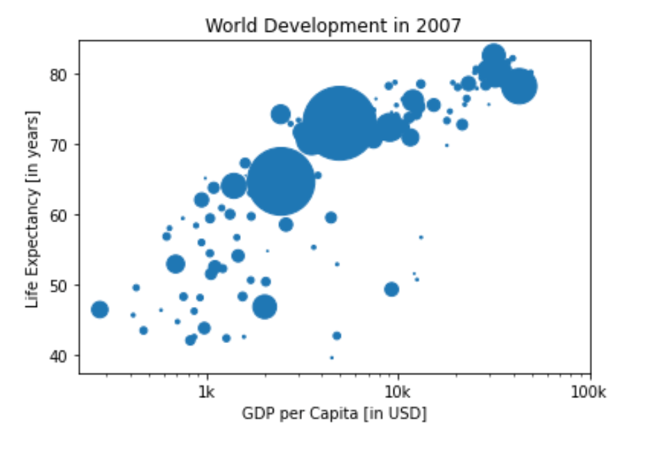
Sizes
Right now, the scatter plot is just a cloud of blue dots, indistinguishable from each other. Let’s change this. Wouldn’t it be nice if the size of the dots corresponds to the population?
To accomplish this, there is a list pop loaded in your workspace. It contains population numbers for each country expressed in millions. You can see that this list is added to the scatter method, as the argument s, for size.
# Store pop as a numpy array: np_pop
np_pop = np.array(pop)

# Adjust np_pop
np_pop = np_pop / 570000

# Update: set s argument to np_pop
plt.scatter(gdp_cap, life_exp, s = np_pop)

# Previous customizations
plt.xscale('log')
plt.xlabel(xlab)
plt.ylabel(ylab)
plt.title(title)
plt.xticks(tick_val,tick_lab)
plt.rcParams["figure.figsize"] = (6,4)

# Display the plot
plt.show()
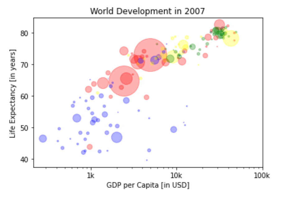
Colors
The code you’ve written up to now is available in the script.
The next step is making the plot more colorful! To do this, a list col has been created for you. It’s a list with a color for each corresponding country, depending on the continent the country is part of.
How did we make the list col you ask? The Gapminder data contains a list continent with the continent each country belongs to. A dictionary is constructed that maps continents onto colors:
# map continents onto colors
dict = {
    'Asia':'red',
    'Europe':'green',
    'Africa':'blue',
    'Americas':'yellow',
    'Oceania':'black'
}

# Mapping the dictionary keys to the data frame.
gapminder_2007['color'] = gapminder_2007['cont'].map(dict)

col = gapminder_2007['color'].to_list()

# Specify c and alpha inside plt.scatter()
plt.scatter(x = gdp_cap, y = life_exp, s = np.array(pop) / 570000, c = col, alpha=0.3)

# Previous customizations
plt.xscale('log')
plt.xlabel('GDP per Capita [in USD]')
plt.ylabel('Life Expectancy [in years]')
plt.title('World Development in 2007')
plt.xticks([1000,10000,100000], ['1k','10k','100k'])
plt.rcParams["figure.figsize"] = (6,4)

# Show the plot
plt.show()
plt.clf()
<Figure size 432x288 with 0 Axes>
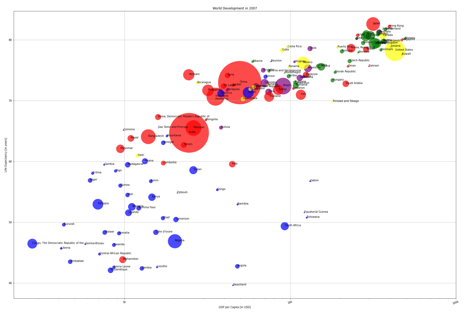
Additional Customizations
If you have another look at the script, under # Additional Customizations, you’ll see that there are two plt.text() functions now. They add the words “India” and “China” in the plot.
# Scatter plot
plt.scatter(x = gdp_cap, y = life_exp, s = np.array(pop) / 70000, c = col, alpha=0.5)

# Previous customizations
plt.xscale('log')
plt.xlabel('GDP per Capita [in USD]')
plt.ylabel('Life Expectancy [in years]')
plt.title('World Development in 2007')
plt.xticks([1000,10000,100000], ['1k','10k','100k'])

# Additional customizations
plt.text(1650, 70, 'India')
plt.text(4500, 79.5, 'China')

# Add grid() call
plt.grid(True)

# Increase size of plot in jupyter
# (you will need to run the cell twice for the size change to take effect, not sure why)
plt.rcParams["figure.figsize"] = (18,12)

# Show the plot
plt.show()
plt.clf()

Country Lables
Let’s find a way to color code North and South America. The library pycountry_convert should help with identifying each countries continent. We’ll need to make sure all of the country naming conventions are consistent though. We’ll need to spot check the country names to do so.
import pycountry_convert as pc
def convert(row):
    cn_code = pc.country_name_to_country_alpha2(row.country, cn_name_format = 'default')

    conti_code = pc.country_alpha2_to_continent_code(cn_code)
    return conti_code
# We'll need to make sure all of the country naming conventions are consistent.
gapminder_2007.loc[335,'country'] = 'Congo, The Democratic Republic of the'
gapminder_2007.loc[347,'country'] = 'Congo'
gapminder_2007.loc[371,'country'] = 'Côte d\'Ivoire'
gapminder_2007.loc[671,'country'] = 'Hong Kong'
gapminder_2007.loc[839,'country'] = 'Korea, Democratic People\'s Republic of'
gapminder_2007.loc[851,'country'] = 'Korea, Republic of'
gapminder_2007.loc[1271,'country'] = 'Réunion'
gapminder_2007.loc[1679,'country'] = 'Yemen'

# Palestine (Westbank and Gaza) are not recognized as countries in this library.
# We'll need to drop them to map the continents.
# Free Falestine.
gapminder_drop = gapminder_2007.drop(1667) # West Bank and Gaza

# Create continent column
gapminder_drop['continent'] = gapminder_drop.apply(convert, axis=1)
print(gapminder_drop.head())
        country  year  population      cont  life_exp       gdp_cap   color  \
11  Afghanistan  2007  31889923.0      Asia    43.828    974.580338     red
23      Albania  2007   3600523.0    Europe    76.423   5937.029526   green
35      Algeria  2007  33333216.0    Africa    72.301   6223.367465    blue
47       Angola  2007  12420476.0    Africa    42.731   4797.231267    blue
59    Argentina  2007  40301927.0  Americas    75.320  12779.379640  yellow

   continent
11        AS
23        EU
35        AF
47        AF
59        SA
# Check the country name of KR
print(pc.country_alpha2_to_country_name('KR'))
Korea, Republic of
# Create continent dictionary
continent_dict = {
    'AF': 'Africa',
    'NA': 'North America',
    'OC': 'Oceania',
    'AN': 'Antarctica',
    'AS': 'Asia',
    'EU': 'Europe',
    'SA': 'South America',
}

# Import continent codes dataframe
continent_codes = pd.read_csv('https://datahub.io/core/continent-codes/r/continent-codes.csv', header=None)

# Spot correct North America's continent code
continent_codes.loc[2,0] = 'NA'

# Recreate continent dictionary
continent_dict = continent_codes.set_index(0).to_dict()[1]

# Print dict
print(continent_dict)
print()

# Create continent description column
gapminder_drop['cont2'] = gapminder_drop.continent.map(continent_dict)
print(gapminder_drop)
{'Code': 'Name', 'AF': 'Africa', 'NA': 'North America', 'OC': 'Oceania', 'AN': 'Antarctica', 'AS': 'Asia', 'EU': 'Europe', 'SA': 'South America'}

          country  year  population      cont  life_exp       gdp_cap   color  \
11    Afghanistan  2007  31889923.0      Asia    43.828    974.580338     red
23        Albania  2007   3600523.0    Europe    76.423   5937.029526   green
35        Algeria  2007  33333216.0    Africa    72.301   6223.367465    blue
47         Angola  2007  12420476.0    Africa    42.731   4797.231267    blue
59      Argentina  2007  40301927.0  Americas    75.320  12779.379640  yellow
...           ...   ...         ...       ...       ...           ...     ...
1643    Venezuela  2007  26084662.0  Americas    73.747  11415.805690  yellow
1655      Vietnam  2007  85262356.0      Asia    74.249   2441.576404     red
1679        Yemen  2007  22211743.0      Asia    62.698   2280.769906     red
1691       Zambia  2007  11746035.0    Africa    42.384   1271.211593    blue
1703     Zimbabwe  2007  12311143.0    Africa    43.487    469.709298    blue

     continent          cont2
11          AS           Asia
23          EU         Europe
35          AF         Africa
47          AF         Africa
59          SA  South America
...        ...            ...
1643        SA  South America
1655        AS           Asia
1679        AS           Asia
1691        AF         Africa
1703        AF         Africa

[141 rows x 9 columns]
# Create continent color dictionary
color_dict = {
    'Asia':'red',
    'Europe':'green',
    'Africa':'blue',
    'North America':'yellow',
    'Oceania':'black',
    'South America':'purple'
}

# Map continent colors to columns
gapminder_drop['color2'] = gapminder_drop['cont2'].map(color_dict)
print(gapminder_drop.head())
        country  year  population      cont  life_exp       gdp_cap   color  \
11  Afghanistan  2007  31889923.0      Asia    43.828    974.580338     red
23      Albania  2007   3600523.0    Europe    76.423   5937.029526   green
35      Algeria  2007  33333216.0    Africa    72.301   6223.367465    blue
47       Angola  2007  12420476.0    Africa    42.731   4797.231267    blue
59    Argentina  2007  40301927.0  Americas    75.320  12779.379640  yellow

   continent          cont2  color2
11        AS           Asia     red
23        EU         Europe   green
35        AF         Africa    blue
47        AF         Africa    blue
59        SA  South America  purple
# Adjust figure size
plt.rcParams["figure.figsize"]=30,20
# Set axis, color, country labels
x = gapminder_drop.gdp_cap.to_list()
y = gapminder_drop.life_exp.to_list()
col = gapminder_drop['color2'].to_list()
txt = gapminder_drop.country.to_list()

# Set tick value labels
tick_value = [1000, 10000, 100000]
tick_lab = ['1k', '10k', '100k']

# Create population list as array for point size
pop = gapminder_drop.population.to_list()

# Store pop as numpy array
np_pop = np.array(pop)

# Double pop numpy array
size = np_pop / 50000
# Clear residual figures
plt.clf()

# Create scatter plot
plt.scatter(x, y, s = size, c = col, alpha=0.6)

# Change plot scale to log
plt.xscale('log')

# Add labels
plt.xlabel(xlab)
plt.ylabel(ylab)
plt.title(title)
plt.xticks(tick_value, tick_lab, rotation=20) # plt.xticks(log_tick_value, log_tick_lab, rotation=20)

# Display grid
plt.grid(True)

# Show the plot
plt.show()

# Clear residual figures
plt.clf()

# Create scatter plot
plt.scatter(x, y, s = size, c = col, alpha=0.7)

# Change plot scale to log
plt.xscale('log')

# Add labels
plt.xlabel(xlab)
plt.ylabel(ylab)
plt.title(title)
plt.xticks(tick_value, tick_lab, rotation=20) # plt.xticks(log_tick_value, log_tick_lab, rotation=20)

# Add country labels
for i, label in enumerate(txt):
    plt.annotate(label, (x[i], y[i]))

# Display grid
plt.grid(True)

# Show the plot
plt.show()

Compare our work!
Check out the following link from Our World In Data to compare our plot to the full range of data for each year in the gapminder dataset!
https://ourworldindata.org/grapher/life-expectancy-vs-gdp-per-capita?time=2007
